tl:dr;
While integrating CSS Grid into our starter theme, Grate we need to restructure our markup, stripping it down to functional HTML components to work with CSS Grid the right way.
A little preface on CSS Grid
CSS Grid is a major milestone for CSS and web development in general and it is finally ready. Yet, to *really* use it properly we can’t just assign some new parameters to existing markup in our CSS. Well, we could, but we shouldn’t. Why not? CSS Grid changes the way we should think about how our HTML is structured.
What does that mean? Well, for the entire history of the web, we have been using extraneous markup just to contain all of our elements that we need to arrange in our layouts, whether we are using floats, or more recently, Flexbox. Flexbox is great (and it works alongside CSS Grid) however it only works in one direction. What’s more, to use Flexbox and floats we need to insert wrapper elements in our HTML to contain the child elements we want to align that are totally unrelated to the function of the document.
If you’ve made the move from floats to Flexbox, you’ll notice the clearfix hack and flexbox do not play nicely with each other. You’ll get all kinds of weird behavior that the clearfix hack was supposed to fix in the first place. Super no bueno.
These extra containers lead to divitis, are woefully unsemantic and now, *are totally unnecessary*.
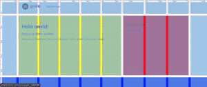
Take this example HTML layout:
The `#content`, `#inner-header`, `#inner-content`, `#inner-sidebar`, and `#inner-footer` divs are only there to be wrappers to contain floats or be flexbox wrappers. They don’t tell us anything about what is in them and really just muddy up your markup.
Clearfix is also super hacky. While it works well enough, it never felt right to me. It solved a very real layout problem but in the process adds extra fluff to the markup. We don’t need it anymore. For years, all of these hacky bits and extra divs is how we have been structuring our markup just to make it work.
Until now, most of our job as web designers is making boxes around other boxes, then adding hacks until the boxes do what we want. What a mess!
It’s time to move on.
With CSS Grid, we can have a much simpler semantic layout like this:
Anyone can read this and know exactly what is going on. This makes sense just as a document, without any rendering at all. What’s great is this structure is fully accessible and without any extra markup, the styles are now functionally completely independent.
We can keep this simple structure and use CSS Grid to do all the heavy lifting for our layout(s) with a few lines of code. No hacks, no calc, no floats. Boom.

// Flexbox fallback for IE10 and Edge
#container {
    display: flex;
    flex-direction: column;
    min-height: 100vh;
}

// Let's target browsers who support the latest CSS Grid spec only
// (!) don't use @supports(display: grid) {} as this will still return true for IE10 and Edge
@supports( grid-area: auto ) {

    // Let's use a simple base 10 grid.
    @media only screen and (min-width: 768px) {

        .grid-aside {
            // create 10 columns of max-width 10em. Simple.
            grid-template-columns: repeat(10, minmax(auto, 10em));
            // create 3 rows: header | content/aside | footer; 'auto' makes header and footer the height of the content
            grid-template-rows: auto 1fr auto;
            // make the header and footer span the full width
            #header, #footer {
                grid-column: span 10;
            }
            // span our main content from columns 1-6 (7 is the start of the new column)
            main {
                grid-column: 1/7;
            }
            // span our aside content from columns 7-10 (can use 11 or -1 for the second value; -1 is the end of the grid)
            aside {
                grid-column: 7/-1;
            }
        }

        // grid for full-width page
        .grid-full {
            grid-template-columns: 1fr;
        }

    } // end of media query

    @media only screen and (min-width: 1170px)   {

        .grid-aside {
            // adjust the grid areas for higher viewports, keeping the content at manageable widths
            main {
                grid-column: 2/7;
            }
            aside {
                grid-column: 7/10;
            }
        }

    } // end of media query


    // grid defaults.
    .grid {
        display: grid;
        margin: 0 auto;
        width: 100%;
        height: 100vh;
        grid-gap: 1em;
    }

    .grid-aside {
        grid-template-rows: auto 1fr auto;
    }

}
So what does this mean for Grate?
When I initially forked Plate to create Grate, it became apparent really quickly that I would have to completely restructure the HTML in the theme templates, stripping it down to only the actual functional components.
Liberate the markup!
With modular, component-based development coming into its own, breaking down the HTML markup into its semantic, functional components is an imperative. Most WordPress sites are not simply blogs and they need to be flexible enough to adapt to any templating system or layout, while still being responsive.
Grate is built with basic, functional HTML components that strip out many of the extra container divs, keeping the markup simple and adaptable. It comes with a default structure much like the example above but with only the base elements, these can be easily swapped out, rearranged or removed completely. Starting with this foundation is good for mobile first, accessibility and SEO at the same time.
Of course developers will need to add their own custom content components to these depending on the nature of the content they want to display. But now, there is (almost) nothing to strip away – the theme is about as agnostic as it can be.
All that said, for Grate, I’ve left in the #inner-header and #inner-footer divs so we can use max-width on the actual header and footer content (using the .wrap class) keeping the outer header and footer elements full width. These elements could be removed once the subgrid property is fully adopted. For now, we still need some interstitial HTML but it won’t be long until the major browsers adopt subgrids.
Just like before, you can use custom page templates to create different layouts. Yet, by using CSS Grid and subgrids, the possibilities are endless and you probably don’t need to use as many templates as before. Think about your page templates in a modular, component-based way and with just a couple page setups, you can cover all of the layouts your site needs. If you start out with a good grid to begin with, you could probably handle multiple layouts with just a few lines of scss.


Great article. I just downloaded Grate yesterday and am very impressed. In this article you answered one of my questions about why the inner header and inner this or that.
This article cleared up alot. Great Job!
Glad this article helped Tom. Just FYI, we’ve fully integrated CSS Grid into our Plate theme: https://github.com/joshuaiz/plate albeit with the #inner-header and #inner-content divs left in as with Grate. Grate just took things a little further. Once CSS Grid subgrids are fully adopted, we’ll be able to remove all of this interstitial markup.