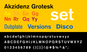
Akzidenzen means ‘commercial work’ or ‘commercial printing’ thus Akzidenz Grotesk was a typeface created for and used in commercial, scientific or trade work. A distinctly modern sans-serif or grotesque typeface, Akzidenz Grotesk is often seen as the modern typeface, influencing all sans-serif typefaces to follow, including Helvetica. Its unadorned monoline design stands in stark contrast to the flourishes of Art Nouveau, also popular in the late 19th century.


In 1890s Germany, many type foundries had their own version of ‘Akzidenz’, each with its own subtle differences. The most notable of these was from the Ferdinand Theinhardt Schriftgiesserei in Berlin, designed by Ferdinand Theinhardt. The Berthold Type Foundry collected many of these metal type specimens and released Akzidenz Grotesk commercially in 1896.
Beginning in the 1950s, under the direction of Günter Gerhard Lange, additional weights and styles were added to Akzidenz Grotesk, including the ‘Super’ in 1968 and a ‘Super Italic’ in 2001. With these new weights, Akzidenz Grotesk was one of the major type components of the International or Swiss design style which has had a huge influence on graphic design worldwide.

Akzidenz Grotesk was the original typeface for the MTA and NYC Subway system starting in 1970, although over time the MTA has not upheld the graphic standards set by Unimark and used by Massimo Vignelli for the iconic NYC Subway maps.


While H. Berthold AG folded in 1993, Chicago-based Berthold Types Ltd. now distributes the Berthold digital type library. The Open Type version of Akzidenz Grotesk was released in 2006 under the name ‘Akzidenz Grotesk Pro’.
When I first saw Akzidenz Grotesk I knew it had a similar feeling to Helvetica but there was something different about it. It connotes ‘design’ a bit more than the Helvetica ‘human-ness’. The lowercase ‘e’ of the Medium font is what always stands out for me.
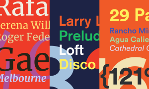
The Mike Joyce posters below show how timeless Akzidenz can be.


I still love using Akzidenz and it’s one of the first typefaces I’ll try when doing mockups.