-
Home Page
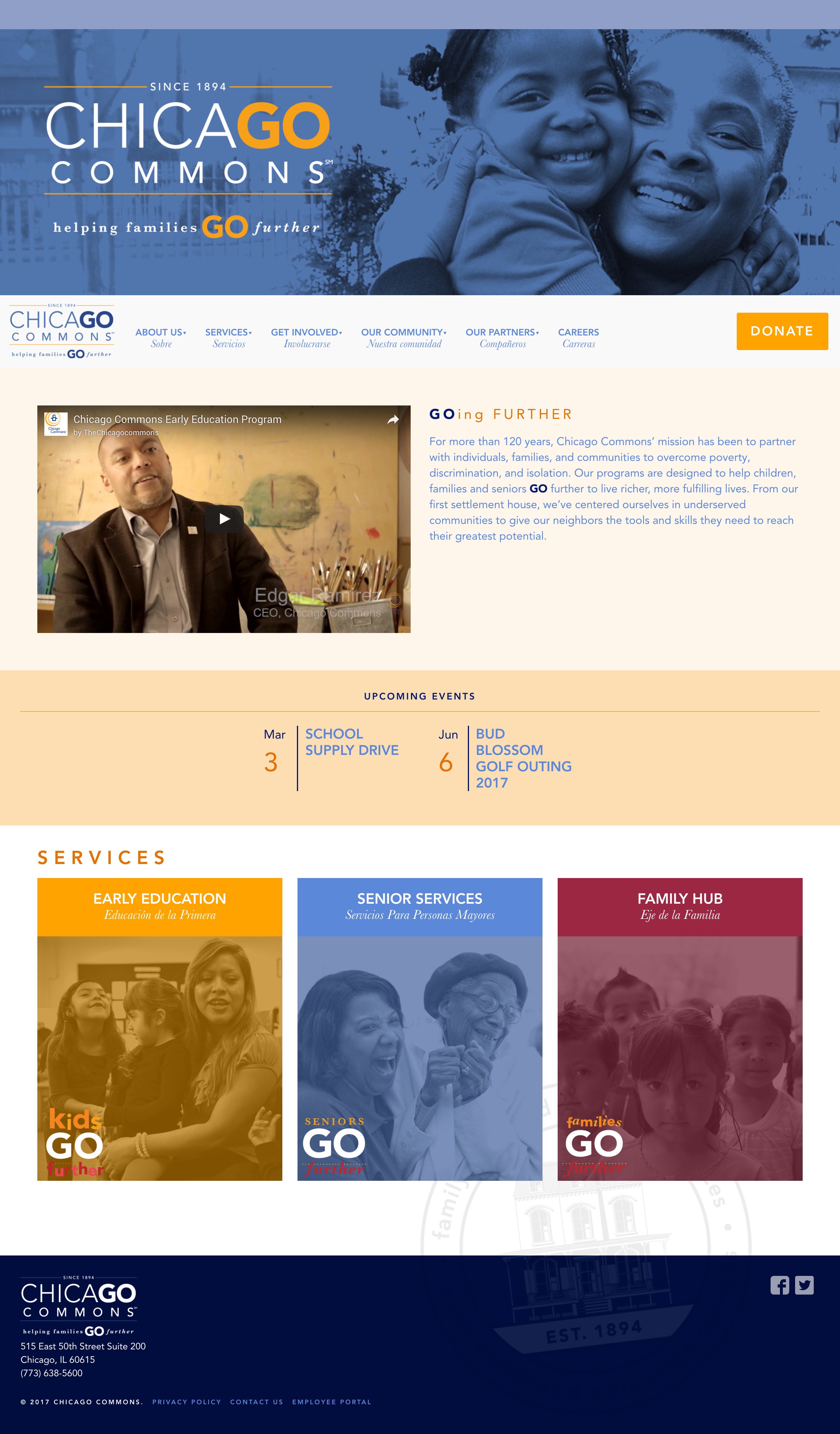
Home Page features latest video section, upcoming events and the service boxes. -
Early Education
Outcomes and resources are highlighted. -
Family Hub
Color and graphics are used to break up text.
Chicago Commons
Full redesign for this service-based Chicago non-profit.
https://chicagocommons.org/ ↗We first worked on Chicago Commons website in 2013 and we then made it fully responsive, brought much needed color and applied their branding site wide. In 2016 they did a complete branding overhaul and while it wasn't done by studio.bio, the design was great. Thus, they needed us to give the site a complete overhaul to not only apply their new branding but make the site more engaging for their users and easier to use for the staff.
We fully customized their admin making it easy for them to focus on the content. Full-width banners were implemented across all of the top-level pages to draw users in with flashes of color yet keeping important elements above the fold. Customized sidebars were used on targeted pages to provide additional information and resources that didn't interrupt the flow of the main section of the page. A priority was placed on the results of their highly successful programs so we tried to make what could be boring data on a spreadsheet jump off the page with color and typographic elements. The Donate page was also completely redone and simplified with easy to select amounts and less fields to drive conversions.
So far, the people at Chicago Commons could not be happier. We're glad they asked us back.

