-
Home Page
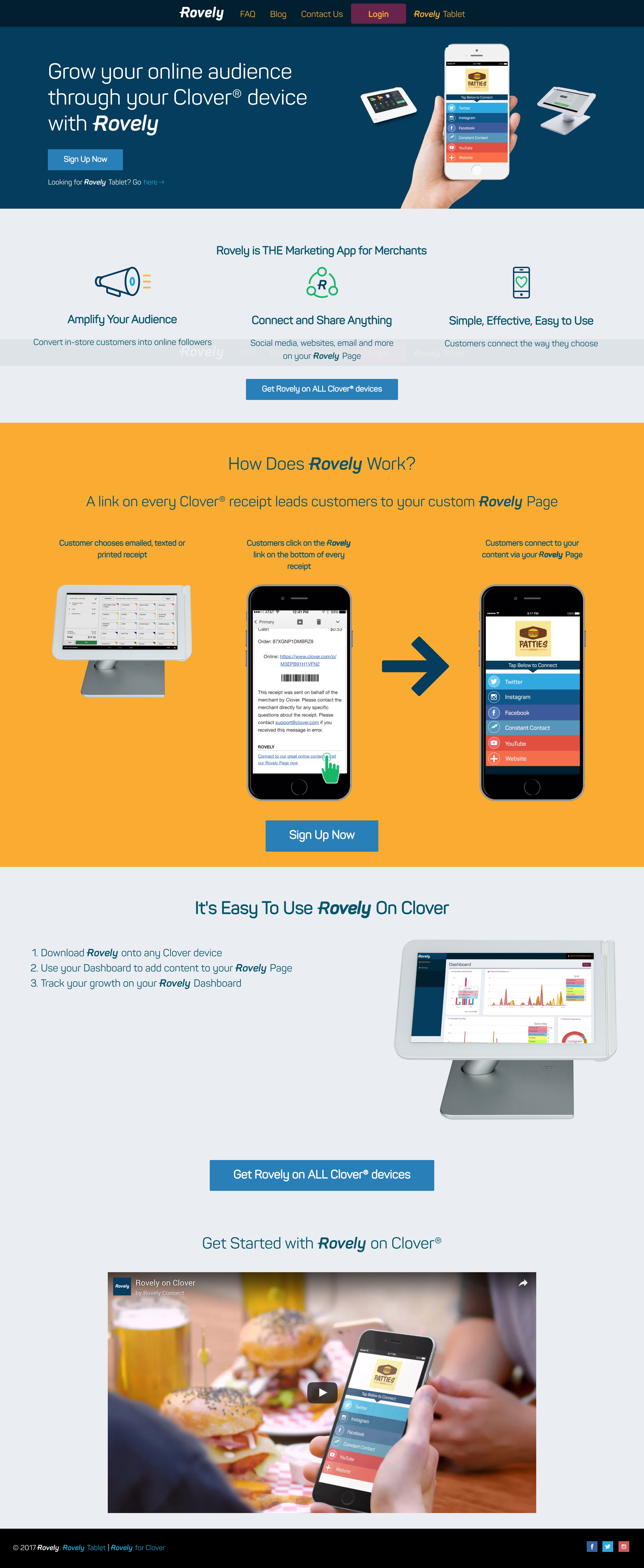
Bold splashes of color, crisp lines and custom icons help explain and inform -
Clover Page
Color bands and dynamic images split up what could have been a wall of text -
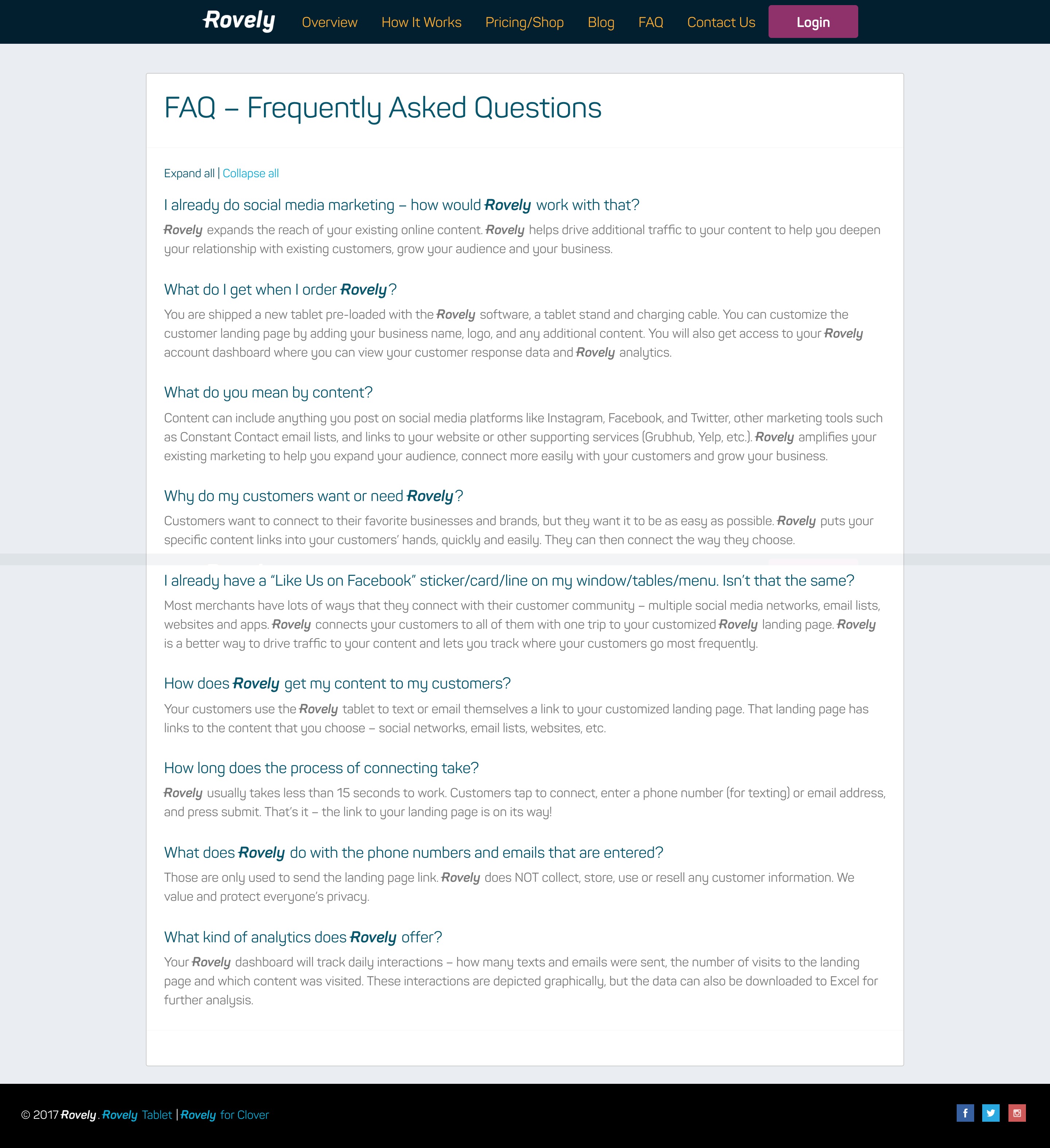
FAQ
Rovely is a new service that connects customers directly to the social media outlets of the businesses they frequent. Businesses sign up for Rovely and then they are sent a tablet for customers to use in-store. They send social media links directly to their mobile devices where they connect instantly. In addition, Rovely gives businesses advanced analytics and metrics so they can follow up with their customers and foster deeper connections.
For Rovely's branding, we spent a lot of time going over shades of green and blue to develop the color palette. We wanted it to be just off of familiar but still inviting. We chose the Panton typeface and then added the small triangle on the 'R' and customized a few of the letterforms to round out the main logo. For the website, we wanted to keep it clean and crisp with bold splashes of color. Custom icons and horizontal content bands break up the information into easy sections.


