“A great typeface makes me happy.”
— Joshua
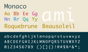
The Monaco typeface was designed by Susan Kare and Kris Holmes at Apple in 1988. Susan Kare designed all of the early Apple type and icons which gave the Mac its personality. Anyone who has owned a Mac has seen the Monaco typeface as it has been installed since System 6 through today’s macOS.
While I was doing post-graduate research at UC Berkeley in the early 1990s, the lab I was in had NeXT computers which used Monaco by default for the terminal and I think that is where my affinity for Monaco began. For all things terminal and coding, I have used Monaco ever since.

The first character you notice is, of course, the lowercase “a”. Traditionally used for serif italic fonts, the single-storey, curvy “a” adds a wonderful counterbalance to the rigid, vertical arms and the serif-like lowercase “i” and “l”.
I’ve always found Monaco the most readable monospaced font, even at extremely small sizes.

The almost circular parentheses and overly angled square brackets are used extensively in coding and not only distinguish Monaco from other monospaced typefaces but they help me find functions and arrays quickly.

Eventually with coding you will decide to try a new typeface or theme for your text editor and I have tried many other typefaces. Every coder has their own favorite so there is no best typeface to use. I’ll try one or the other for a little while but invariably I will return to Monaco and when I do I always feel I’m back home.

Apple replaced Monaco with Menlo as the default terminal and XCode typeface with Snow Leopard and more recently with SF Mono (shown above) which I really like, however I can’t see giving up Monaco anytime soon.


